Hot Templates
houseofcardssmooth slow motion onlineviral slowmo dumpproduct photography near mecreate slow motion videobest family photographers near mefunnyvideoavid slow motioncagraduation photo studiochair3Hug Boyfriend AIbest app for video slow motionflow velocityKpop Demon Hunter aikings beachhome photo studiogirllikemejjkenyalwaiting chair 3 seater
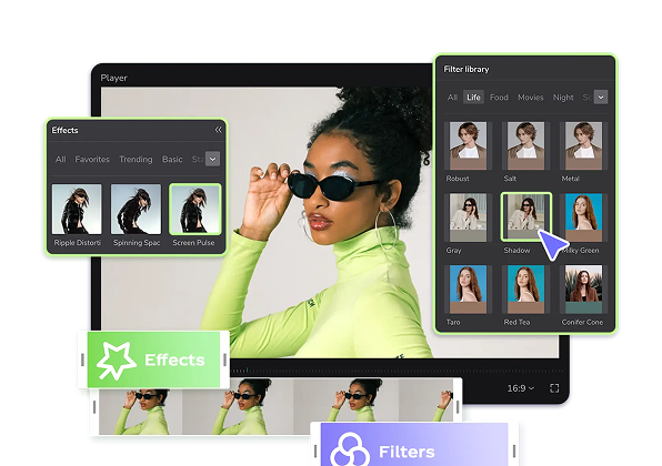
bootstrap grid layout
Add new video

00:07
1
Grid

00:24
28
4 grid aesthetic
00:15
172
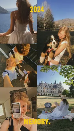
2024 memory

00:19
6
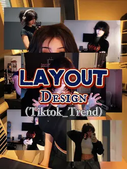
Layout Design

00:09
5.7k
travel layout 🌴
houseofcards
smooth slow motion online
viral slowmo dump
product photography near me

00:10
3
3 clips in 1 frame

00:09
260
four clip grid

00:13
154.1k
3 grid 9 vids

00:09
7
You and me
00:14
579.9k
retro scroll layout

00:10
5
Virtual Tabs

00:29
67
four screens

00:11
648
ig layout collage

00:10
16
Split screen templat

00:19
220
Layout Design
00:09
338
Layout design

00:12
11.2k
spring collage 💐

00:09
1.3k
layout grid scroll