Popularne szablony
Free Tworzenie Srcset Templates By CapCut
Add new video
00:12
65
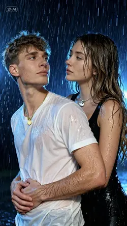
Rain Photoshot

00:12
92
Paar-Fotocollage

00:13
227
2 Fotos

00:25
579
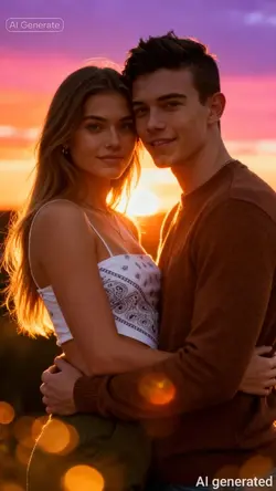
Cuple sunset Ai

00:10
139
Romantic Running AI
aplikacja do rozmywania tła
obrazy z tekstu za pomocą sieci neuronowej
bezpłatny kreator kolaży zdjęć online
filtry fotograficzne iPhone

00:14
4.4k
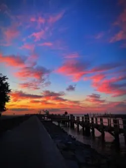
Sunset photoshoot
00:13
5.7k
Hug Sunset
00:07
2.5k
Try this on a sunset
00:12
226
RAIN SWEET MOMENTS
00:10
24
sunset photoshoot
00:13
305
2 Fotos hinzufügen

00:13
265
Add 2 photos

00:13
83.1k
Rain photoshoot

00:13
80
Rain Couple photos

00:13
303
Ajouter 2 photos

00:10
446
Santorini Sunset AI