Populaire sjablonen
srcset tool
Add new video
00:12
29.6k
B M W 🔥
00:14
6.0k
Static car edit
00:09
24.5k
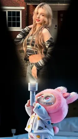
Labubu
00:10
42.2k
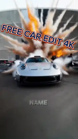
Free car edit 4k
00:11
285
DARK EDIT📈💀
hoogtekaart maken
dslr foto achtergrond
ai anime kunst generator van tekst
automatisch fotobewerkingsprogramma
00:17
194
SCP edit
00:10
174
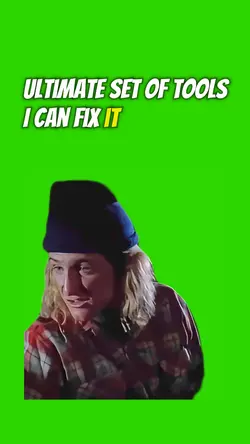
ULTIMATE Tool Set
00:01
2.6k
Stitch wallpaper

00:06
235.0k
Jumpscare
00:04
1.8k
Follow TikTok icon
00:03
163.2k
Labubu wallpaper

00:11
573.2k
earth zoom

00:16
68.4k
Skull face templat 🏆
00:10
694.9k
Rizz edit
00:12
17.8k
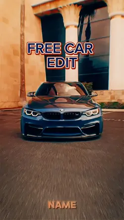
Free car edit
00:12
31.8k
#CapCut New Trend
00:12
7.9k
Try this wallpape
00:09
13.0k
Phone edit