Șabloane populare
Free Instrument Srcset Templates By CapCut
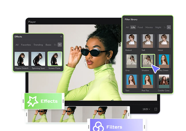
Add new video
00:22
11.9k
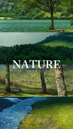
nature therapy
00:39
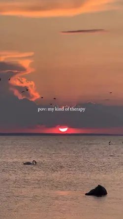
6.4k
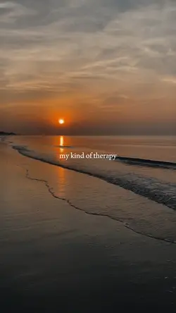
my kind of therapy

00:43
2.1k
Piano template
00:06
1.1k
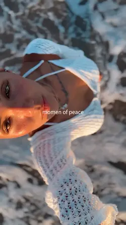
momen of peace
00:10
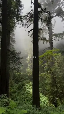
1.9k
relax
editor foto blurare fundalului
aplicație online editare poze gratuită
text pe imagine online
conturează imagine online
00:14
355
Sunrise therapy
00:30
8.4k
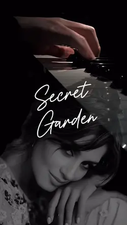
Secret garden Piano
00:15
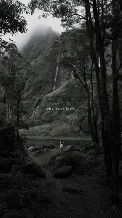
1.8k
the best view
00:08
2.7k
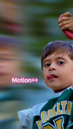
Motion

00:13
79
sunset therapy

00:14
2.0k
🌸

00:18
14.3k
vitamin sea
00:12
3.4k
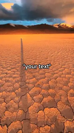
Desert
00:07
5.9k
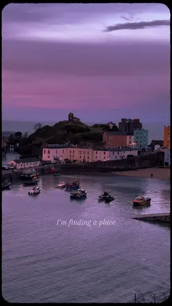
Finding a place 🌅🎬
00:18
7.2k
Add 8 clips

00:31
211
Piano romantic musi
00:19
1.6k
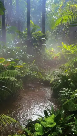
Rainforest
00:59
5.1k
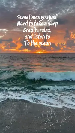
Listen to the ocean