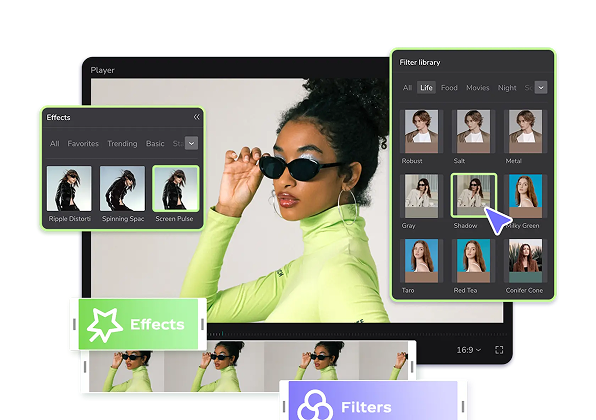
Template Populer
Template Alat Srcset Gratis Dari CapCut
Add new video
00:13
80.9k
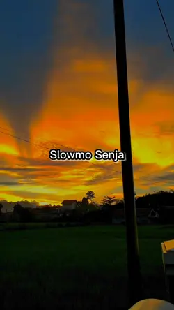
Slowmo Sunset
00:16
237
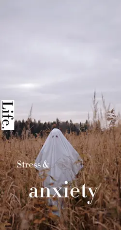
anxiety

00:14
1.9k
Template Affiliate

00:15
50.7k
AI Street Style
00:12
15.4k
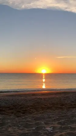
Story sunset pantai
Pembuat Seni Gambar AI
Latar Belakang Editing Foto Dslr
Aplikasi Edit Foto Cymera
Ubah Mata Di Foto

00:16
15.6k
sunset

00:23
328
AI Street Style
00:12
268.6k
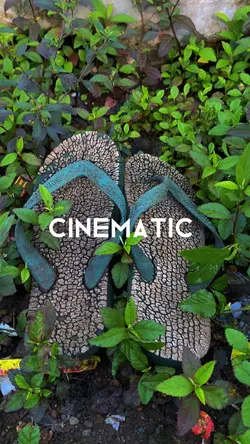
Cinematic sendal

00:14
585
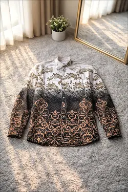
Review cardigan🤎

00:27
2.5k
AI STYLE HEALING
00:16
9.8k
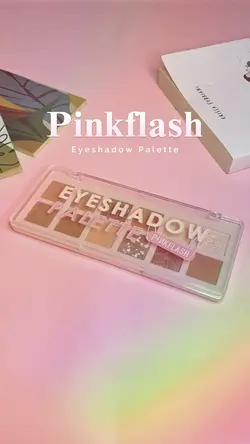
produk affiliate

00:07
155.2k
slomo estetik
00:15
15.8k
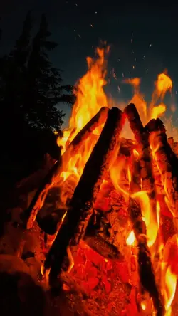
Slowmotion fire

00:15
9.3k
AI Coffee Shop
00:20
14.0k
Template Affiliate
00:17
33.7k
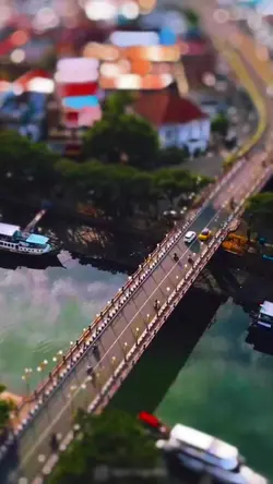
Lensa Tiltshift
00:19
1.9k
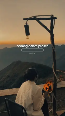
sedang dalam proses
00:15
245
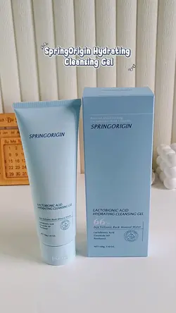
cleansing gel